Tuesday, December 6, 2011

I Am Andy Goldsworthy

I couldn't avoid them, they have invaded my yard, it seems like there are several million of them. Those little pine cones that were just worthless when I was a kid. They were small and too light to throw at someone and really were no fun and had no use other than what God intended them to do. So when assigned to make some nature art I thought maybe these pine cones could finally serve a different purpose after all.


my first idea was to stack them in triangles on top of the rock and see how high of a tower I could construct...


... that was the best looking picture from that idea.

so I moved to the ground...


after awhile I began to realize that these pine cones do not make for the building of sturdy structures. As I tried to go bigger it looked more and more like what it was, just a mound of pinecones...


I was determined, I knew that inside these pine cones lives a want to be part of something different. So why not bring just a little order to their chaos. I decided to go 2D with my final image to utilize the beautiful curves of these seed nurturing vessels...


just like the real Andy Goldsworthy nature took it's course on my creation and it is no longer there. This force of nature has a name, he is Rebel, & this is his guilty face...

Monday, November 21, 2011

FONT

Stencil

The Stencil font is an all-capital face Sans Serif font. The characters are designed to emulate the look of bold, cut-out stencil letters. The Stencil typeface was created in 1937 and released by two different companies within months of each other. R. Hunter Middleton was given credit for its release with the company Ludlow. Gerry Powell was given credit for its release with American Type founders. The font has become famous through use in army-themed displays and in the past was used as a quick way to paint labels on all types of containers. Stencil has been copied and developed in the computer age by many different digital producers. The stencil font has peaked in it's popularity and will not be used as often as in the past. I believe people of all ages will get the most use out of it just playing with stencils for arts & crafts type projects. I am sure at some point there will be another Hollywood movie or TV show that will use it but those days seem to be numbered as well. The biggest use of stencil in the future will still be to label containers. All over the world the font is used in many languages to label boxes or containers for shipping and packaging, this will continue to be the #1 use of the stencil font.


The TV show MASH even branded their now famous own form of stencil font:


Sources:
American type design & designers By David Consuegra
Adobe.com

Monday, October 17, 2011

Color Test!

Color Test - Results


Your Existing Situation

"Works well with others, as long as he doesn't have to take the lead. Longs for relationships which are understanding and relatively conflict-free."

Your Stress Sources

Tries to hold back his normal enthusiastic and imaginative self in fear that he may get carried away by it and chase after unrealistic goals. Feels betrayed and used and is staying emotionally distant to keep others from hurting him more. His is distrusting and suspicious of the actions and intentions of other people.

Your Restrained Characteristics

Open and emotionally involved in relationships and easily finds satisfaction through sexual activity.
Current situations force him into compromise and placing his own hopes and desires on hold for the time being.
"Believes his hopes and dreams are realistic and sticks to them stubbornly, even though circumstances are forcing him to compromise. Very precise in the qualities he seeks in a partner."
"Although he is able to find contentment through sexual activity, he feels hopeless to change his problems and difficulties and continues to make the best of what he has."
"Believes his hopes and dreams are realistic and sticks to them stubbornly, even though circumstances are forcing him to compromise. Very precise in the qualities he seeks in a partner."

Your Desired Objective

"Strives for full life which includes activities and experiences, as well as, a close relationship offering sexual and emotional satisfaction."

Your Actual Problem

"Is disappointed and let down, feels there is no point in making new goals as they will leave him feeling the same way. Looking for friendly, pleasant relationships with others, who will further develop his intellect. Feels his current relationships are empty and holding him back. Reacting with an intense desire to become involved in various activities aimed at achieving his goals."

Your Actual Problem #2

"Wishes he was more spontaneous and impulsive, but holds back because he needs things to be in order, rational, and clearly defined."

Claude Monet

The following four paintings were done by Claude Monet.


The first Painting is titled "The Thames at Westminster" and was done in 1871. Monet used a very limited color palette on this piece. The colors used have a green tint ranging from a light olive green to a dark forest green. Black is used for the people buildings boats and docks, white is used to lighten the sky and splashes in the water. The colors he chose to use are harmonious.

The painting evokes a feeling of everyday busy life on the waterfront.


The second painting is titled "Houses of Parliament, London, Sun Breaking Through the Fog" and was done is 1904. It was painted with more of a broad color palette you can see almost every color of the rainbow in this piece. I think it is interesting how he makes this piece use all of the colors but it is still dark when you look at it. He really gave it a fuzzy mysterious feel that is a lot like the effects of fog on the eyes. At first glance I didn't realize how bright the hot spots get with the oranges and yellows, it really gives the feel of being foggy.  The dark areas where the fog has no light on it are dark and grey and blurred just like in real life. This combination of colors is not harmonious.

This piece gives me a mysterious type feeling. It looks like what could have been an old cover to the book "Dante's Inferno".


The third painting is titled "Le Parlement, Effet de Brouillard" and was also done in 1904.  Once again Monet used a limited color palette. It seems the base color of this piece was purple mixed with a little dark blue. In the sky and in the water he uses some green and white. This color scheme is harmonious.

This piece also gives off a foggy mysterious feeling, but it seems colder because of the absence of any warm colors.


The fourth and final painting is titled "Houses of Parliament, London" and was done in 1905. This piece uses a very broad color palette. I like how he depicted the sun shining off of the water and the shadow the tower casts. This painting feels a lot edgier than the other three, this time there is no fog but still the straight lines of the buildings are not clear. In a way this seems more abstract than the other 3 paintings. The colors that he used are not harmonious but they go very well with each other.

This image does not evoke as strong of feelings as the other 3 did to me. This painting seems like a lazy sunny day to me.                          

Of the four Monet images that I just posted the 1 that stands out to me that I like the most is definitely the second one "Houses of Parliament, London, Sun Breaking Through the Fog". I really like the light coming out from behind the dark and how mysterious the dark parts are. He used so many colors and at first glance it just looks dark with a light spot in it. There really is a lot of detail in it and where it is dark it just blurs away into the fog.  I have never really stopped and appreciated a Monet and now I am very glad to learn more about him and his work.

Monday, October 10, 2011

2 Gestalt Principles


Grouping-Location

Proximity:Combine
  
When elements are placed  close together they are perceived as a group and PROXIMITY occurs. 
It is interesting how our minds puts items together just by them being placed near each other even if they don't go together in the real world. 

Just as Andy Rutledge explains in his blog,  "things that are close to one another are perceived to be more related than things that are spaced farther apart." http://tinyurl.com/4yh75lx

here is a really cool example of proximity: 


 and another, it's amazing how the small elements do not touch but our minds create the borders.


This seems it could work the other way as well. Elements do not need to be touching each other for our mind to see them as a group. So you must be careful how you place elements, if you place elements too close together they may be perceived as a group even if you don't want them to be.

It blows me away how good these artists are, somehow they can see how it all goes together even before they put anything on paper!


This logo over the speaker's shoulder is very creative it uses proximity to use these lines together that create a hawk with faces in it.


wow...


now here is my own original work using proximity I placed images together so they would be perceived as a group and I combined images that would not normally go together.


edit/update: now that I have this in my head I am seeing it everywhere.


Sunday, October 9, 2011

what interests me about design?


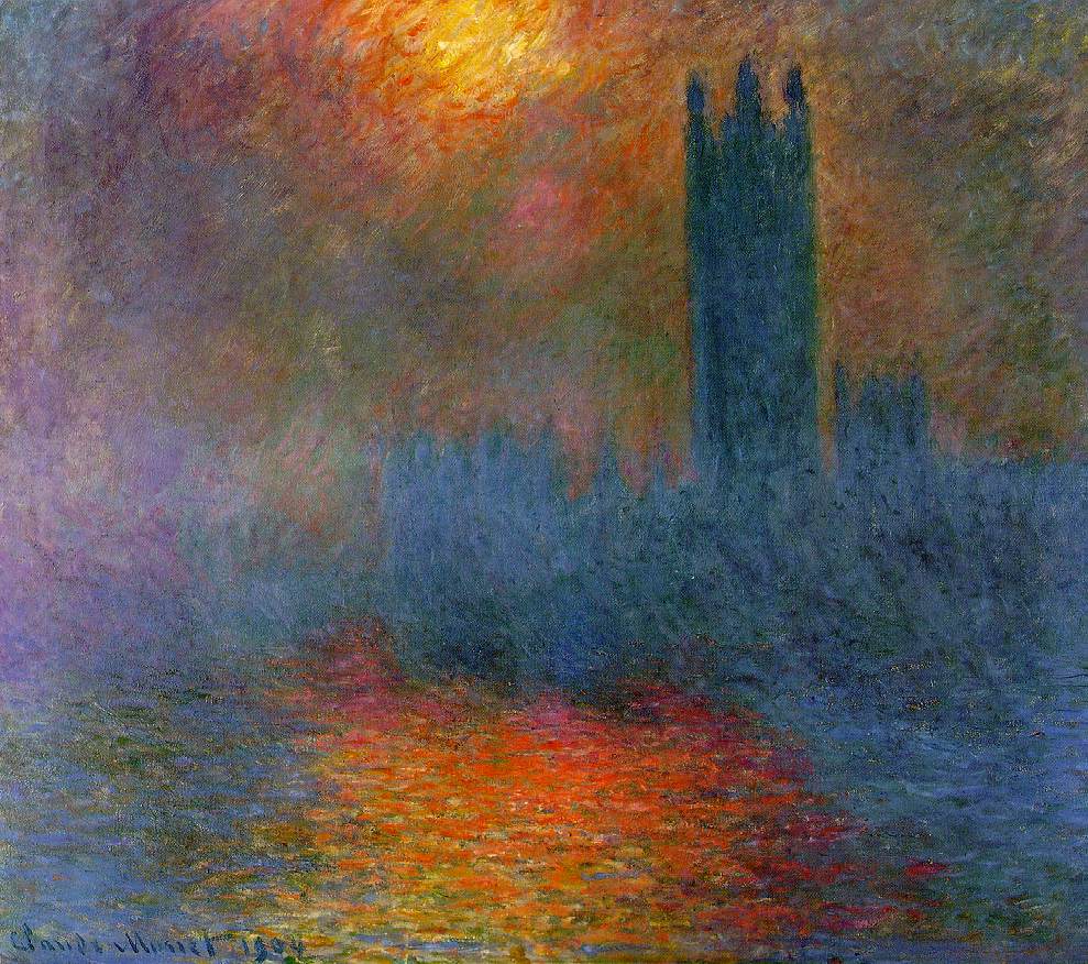
What really interests me about design especially after couple of weeks into my course at Lake Washington Institute of Technology is that it seems to be almost a form of psychology. I am starting to see how the masters of art and design really understand how to draw people’s attention to certain areas of their work. Not only do they make a piece that is pleasing to the eye they direct the flow of how the piece is viewed. They manipulate people’s minds through art in a way that I never saw before, or didn't realize that I saw before. They also understand how to shade and how to use the thickness of lines to show depth and make pieces that look 3D. I have always been fascinated by this and as a kid would spend hours drawing race cars and hydroplanes and I could never make them look as good as my brother could. I have never really been able to draw that well and now I am starting to understand why. I am excited to learn more about art and design as the weeks pass and I hope a little rubs off on me!

2 art & design job calls that are currently available that I would be interested in are:

TEKsystems
3025 112th Ave. NE, Suite 200
Bellevue, WA 98004

Graphic Designer

Required Skills:
HTML, CSS, JAVASCRIPT, PHOTOSHOP, EXCEL


Randy's Ring & Pinion

Everett, WA 98204

 Qualifications:

     2 yr.​ college diploma, certificate from technical school or equivalent combination of education and experience.​
     2+​ yr experience with graphic design in a branded business environment.​

    Adept at using the following tools on a continual basis: Mac Computer, Printer, Camera, Scanner, and Photocopier.​

    Must be proficient in the current releases of the following programs:  Photoshop, Illustrator, Quark Xpress, Acrobat Reader, Acrobat Distiller, Fetch (FTP access), DropStuff, Suitcase, Word, Excel, and Outlook.​  All programs preferably in Mac and PC formats.​ Use of Mac software required.​

    In addition, knowledge of the following programs:  Pagemaker, Freehand, Power, Dream Weaver, Flash, and In Design.

    These 2 jobs share some similarities, both require knowledge of the same type of computer programs and you need the same type of skills to get either job. They seem like very different type of companies and the jobs would probably be a lot different. The Ring and Pinion opportunity sounds like it would be a better chance to be more creative and really help shape the direction of a company. They need someone to do all of their graphics for ads and posters and such. That sounds a lot more interesting than the TekSystems job which seems like you work with many people on many projects for many different companies (clients). You may learn more in that type environment working with other designers and sharing ideas. I still think I would prefer the Ring and Pinion opportunity.